This website contains affiliate links. Some products are gifted by the brand to test. As an Amazon Associate, I earn from qualifying purchases. The content on this website was created with the help of AI.
Creating a stunning gallery wall shouldn’t feel like solving a complex math equation. You know the drill—measuring, marking, re-measuring, and still ending up with crooked frames and nail holes in all the wrong places. But here’s the thing: the most beautiful gallery walls often happen when you ditch the measuring tape and trust your eye instead.
These layouts are about flow, balance, and that effortless, collected-over-time look that makes a space feel personal and lived-in. Whether you’re working with family photos, abstract prints, or a mix of everything, these foolproof approaches will have your walls looking like they were styled by a pro—no ruler required.
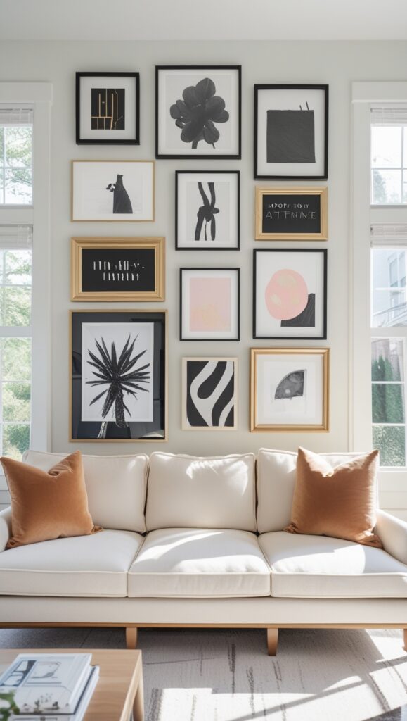
The Paper Template Method: Your Gallery Wall Game-Changer
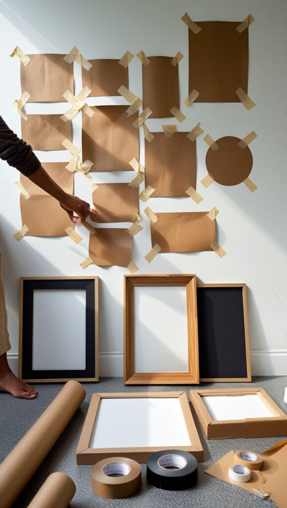
This is hands-down the easiest way to create a gallery wall without any measuring drama. Cut paper templates the exact size of each frame, then tape them to the wall until you find the perfect arrangement. Move them around, step back, adjust—no commitment, no holes, no stress.
Start by laying all your frames face-down on the floor and tracing around each one onto kraft paper or newspaper. Cut out the templates and grab some painter’s tape. Now comes the fun part: stick them up and play around until something clicks.
The magic happens when you stop overthinking it. Trust your instincts about what looks balanced and feels right. Once you’ve got your layout locked in, mark the nail holes through the paper, remove the templates, and hang your frames. It’s foolproof.
Shop the Look:
Dos & Don’ts:
Do use sturdy paper that won’t tear. Don’t rush the arrangement process. Do step back frequently to check balance. Don’t forget to mark your nail holes before removing templates.
The Salon Style: Organized Chaos That Actually Works
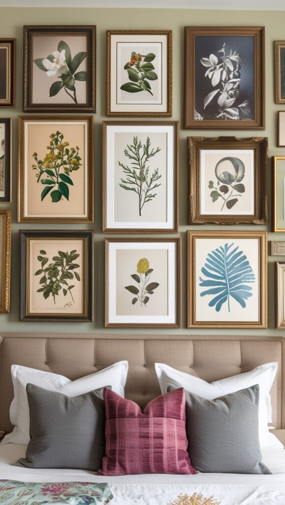
Salon-style gallery walls look effortlessly eclectic, but there’s a method to the madness. The key is creating visual weight balance—not perfect symmetry. Think of it like a well-curated vintage shop where everything feels intentional, even when it’s not perfectly aligned.
Start with your largest piece as an anchor—usually positioned slightly off-center. Then build around it with medium and smaller pieces, leaving roughly 2-3 inches between frames. Mix orientations, sizes, and even frame styles for that collected-over-time vibe.
The beauty of salon style is that it’s forgiving. If something feels off, just swap pieces around until it clicks. There’s no wrong way to do it, as long as the overall composition feels balanced when you step back.
Shop the Look:
Dos & Don’ts:
Do mix frame finishes and sizes. Don’t space frames too far apart. Do include different art styles. Don’t make everything the same height.
The Grid System: Clean Lines Without the Math
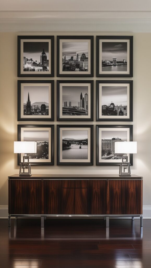
A grid layout gives you that clean, modern gallery wall look without any complicated measuring. The secret is using frames of the same size and creating consistent spacing by eye—no ruler needed.
Choose 4, 6, or 9 identical frames and arrange them in a perfect square or rectangle. The key is keeping your spacing consistent throughout. Use your finger width or a small object as a spacing guide between frames to maintain uniformity.
This approach works beautifully with photography series, abstract prints, or even a mix of art styles. The uniform framing creates cohesion while the consistent spacing gives it that polished, intentional look.
Shop the Look:
Dos & Don’ts:
Do use identical frames for cohesion. Don’t vary the spacing between pieces. Do choose complementary artwork. Don’t hang too high above furniture.
The Organic Flow: Following Your Wall’s Natural Lines
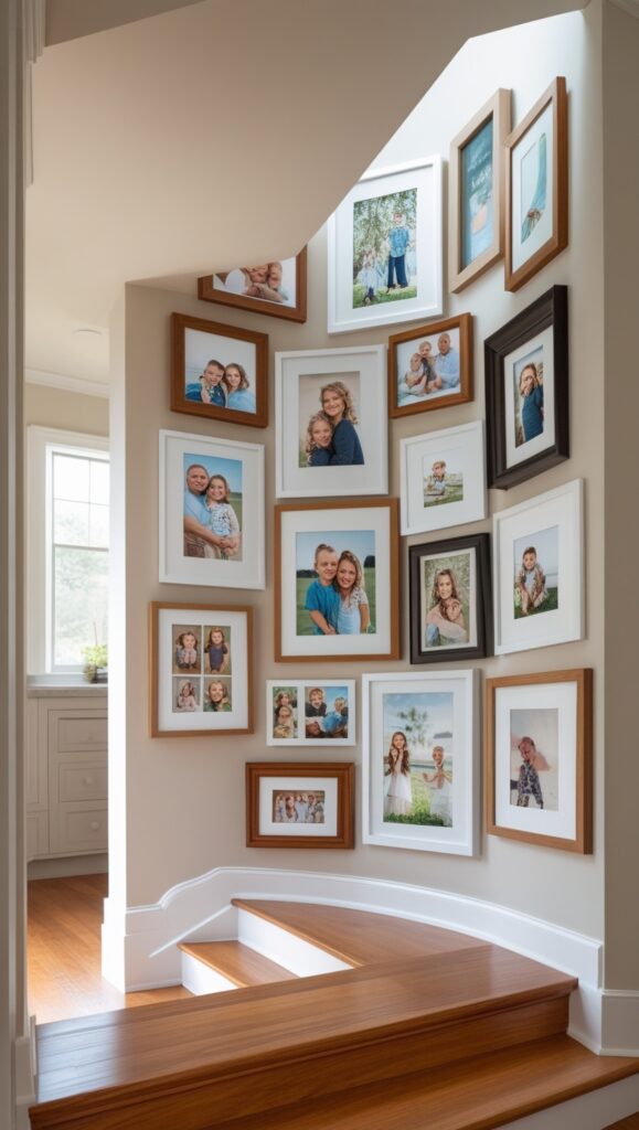
Sometimes the best gallery walls happen when you work with your space’s natural architecture instead of against it. Follow the lines of your staircase, work around a doorway, or create a flowing composition that moves with your room’s energy.
This approach is all about intuition. Start with one piece and let each subsequent frame inform where the next one should go. Think of it as a visual conversation between your art and your space.
The organic method works especially well in hallways, stairwells, or any space with interesting architectural features. Let the wall guide you, and you’ll end up with something that feels perfectly at home.
Shop the Look:
Dos & Don’ts:
Do follow your space’s natural lines. Don’t fight against architectural features. Do vary frame sizes for visual interest. Don’t overcrowd narrow spaces.
The Symmetrical Approach: Balance Without Boring
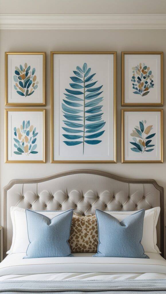
Symmetrical gallery walls feel calm and intentional—perfect for bedrooms or formal spaces. But symmetry doesn’t mean identical. It’s about creating visual balance where both sides feel equally weighted.
Start with a central focal point—your largest or most important piece. Then build outward, balancing each addition with something of similar visual weight on the opposite side. A large frame on the left might be balanced by two smaller frames on the right.
This method works beautifully above beds, sofas, or mantels where you want that grounded, harmonious feeling. It’s classic, timeless, and surprisingly easy to achieve without any measuring.
Shop the Look:
Dos & Don’ts:
Do balance visual weight, not exact sizes. Don’t make both sides identical. Do use a strong central focal point. Don’t forget to consider color balance too.
The Layered Ledge Look: No Nails, No Problem
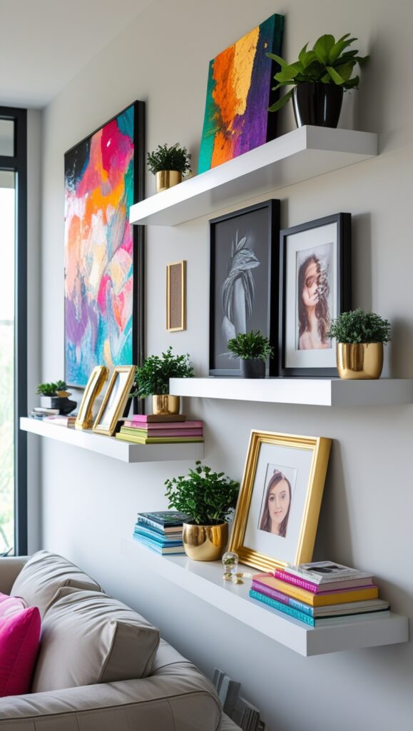
Picture ledges are the ultimate commitment-free gallery wall solution. You can rearrange, swap out, and refresh your display whenever inspiration strikes—no new nail holes required.
Install 2-3 floating shelves at different heights, then layer your frames with larger pieces in back and smaller ones in front. Mix in some books, small plants, or decorative objects to create depth and visual interest.
This approach is perfect for renters or anyone who likes to change things up regularly. It’s also great for displaying a mix of framed art, photographs, and three-dimensional objects together.
Shop the Look:
Dos & Don’ts:
Do layer different sized pieces. Don’t overcrowd the ledges. Do mix art with objects. Don’t make all ledges the same length.
The Corner Gallery: Making Awkward Spaces Shine
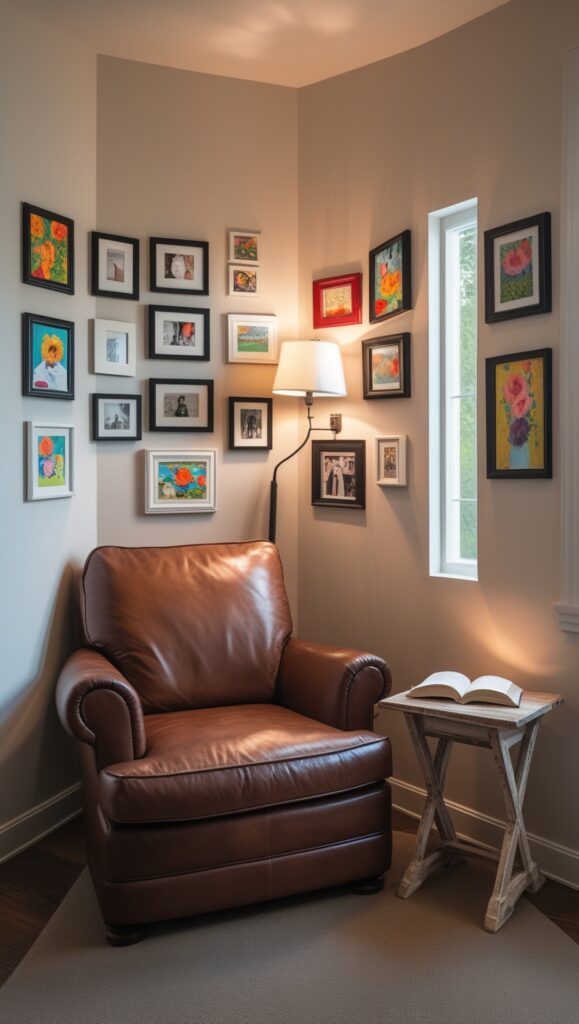
Corner spaces often get overlooked, but they’re perfect for intimate gallery walls that feel discovered rather than displayed. Work with the corner’s natural angles to create something unexpected and personal.
Start with one piece on each wall, then build inward toward the corner. This creates a cozy, wrapped feeling that draws you into the space. It’s perfect for reading nooks, bedroom corners, or that awkward space next to a doorway.
Corner galleries work best with smaller, more personal pieces—family photos, small prints, or meaningful artwork that invites closer inspection.
Shop the Look:
Dos & Don’ts:
Do use smaller, intimate pieces. Don’t overwhelm the corner space. Do consider the viewing angle. Don’t forget proper lighting for the corner.
The Statement Wall: One Big Impact
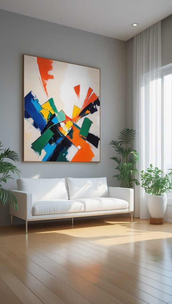
Sometimes less really is more. A single large piece or a small, carefully curated grouping can have more impact than a wall full of smaller frames. This approach is perfect when you have one piece you absolutely love or want to create a calm, uncluttered feeling.
Choose your most impactful piece—whether it’s a large photograph, painting, or even a textile—and give it room to breathe. If you’re grouping smaller pieces, keep it to 3-5 maximum and arrange them tightly together to read as one cohesive unit.
This minimalist approach works beautifully in modern spaces or anywhere you want the art to be the undisputed star of the show.
Shop the Look:
Dos & Don’ts:
Do give large pieces room to breathe. Don’t crowd statement art with other elements. Do consider the scale of your furniture. Don’t be afraid of white space.
The Mix-and-Match Magic: Frames, Shelves, and Objects
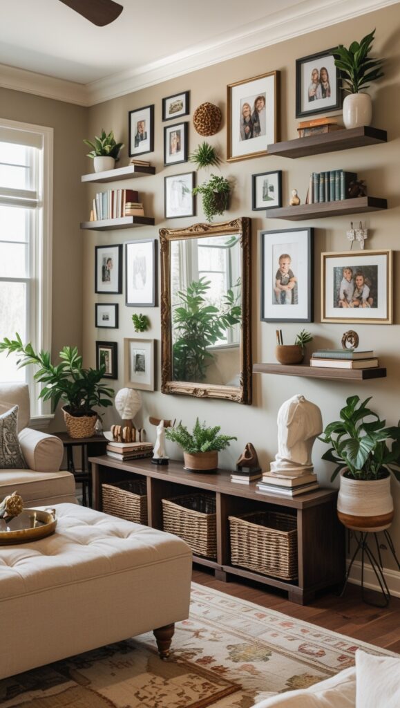
The most interesting gallery walls combine different display methods—framed art, floating shelves, small objects, and even plants. This layered approach creates depth and personality that feels collected over time.
Start with your framed pieces as the foundation, then add floating shelves or small ledges to display three-dimensional objects. Mix in some greenery, books, or meaningful objects that tell your story.
This eclectic approach works especially well in family rooms, home offices, or anywhere you want the space to feel personal and lived-in rather than perfectly styled.
Shop the Look:
Dos & Don’ts:
Do mix different display methods. Don’t let it become cluttered. Do include personal meaningful pieces. Don’t forget to consider color harmony.
The Hallway Runner: Making Transitions Beautiful
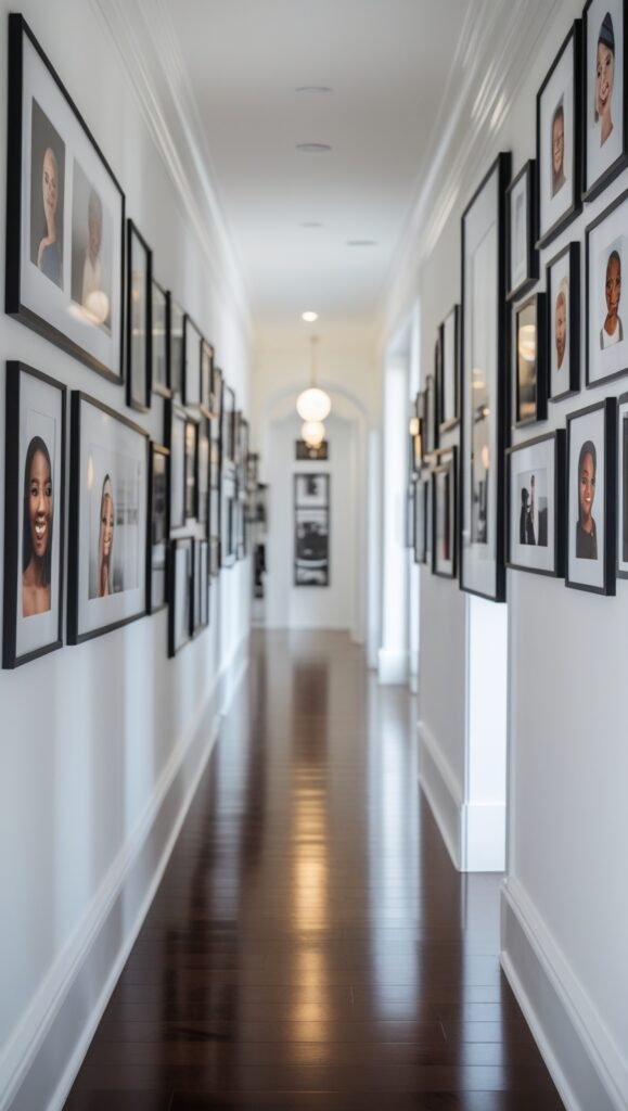
Long hallways are perfect for linear gallery walls that create visual interest as you move through the space. Think of it as a curated journey rather than a destination.
Arrange pieces in a flowing line that follows the hallway’s length, varying heights and sizes to create rhythm and movement. This keeps the eye engaged as you walk through the space and makes even narrow hallways feel intentional and designed.
Consider the lighting in hallways—you might need to add picture lights or ensure there’s enough ambient light to properly showcase your art.
Shop the Look:
Dos & Don’ts:
Do create rhythm with varied heights. Don’t make everything the same size. Do consider lighting needs. Don’t overcrowd narrow spaces.
Pro Tips for Gallery Wall Success
Start Small: Begin with a few pieces and add over time. Gallery walls that evolve feel more authentic than those created all at once.
Consider Your Furniture: Your gallery wall should relate to the furniture below it. Leave 6-8 inches between the top of a sofa and the bottom of your lowest frame.
Think About Color: Even with varied artwork, consider how colors work together. A unifying element—like similar frame colors or a consistent color palette—helps everything feel cohesive.
Light It Right: Good lighting makes all the difference. Natural light is ideal, but picture lights or strategically placed lamps can showcase your art beautifully.
Trust Your Eye: The most important tool isn’t a measuring tape—it’s your instinct for what looks and feels right in your space.
Making It Personal
The best gallery walls tell your story. Mix family photos with art you love, travel memories with pieces that inspire you. Don’t worry about everything matching or following design rules perfectly—the most beautiful walls are the ones that reflect the people who live there.
Remember, gallery walls are never really finished. They’re living, evolving displays that grow and change with you. Start with what you have, trust your instincts, and let your wall develop organically over time.
Whether you choose the structured approach of a grid, the flowing feel of an organic layout, or the flexibility of picture ledges, the key is creating something that makes you happy every time you see it. After all, you’re the one who has to live with it—make it yours.
This website contains affiliate links. Some products are gifted by the brand to test. As an Amazon Associate, I earn from qualifying purchases. The content on this website was created with the help of AI.
No Responses